
By Martin
A couple of years ago I wrote a short paper (here in PDF) with Mike Hulme discussing the evolution of the IPCC's (Intergovernmental Panel on Climate Change) 'reasons for concern' diagram, which became colloquially known as the burning embers. I'm now putting the finishing touches to a longer paper on the production and circulation of the diagram, and how it's become a prominent part of the visual culture of climate change. Last week, a new chapter opened in this story with the publication of the IPCC's Working Group II report on Impacts, Adaptation and Vulnerability. As with previous updates to the diagram, the headline is: "it's worse than we thought".
Origins
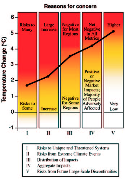
The burning embers began their life in the IPCC's Third Assessment Report in 2001 (see the right hand side of the figure below). The diagram was used to illustrate the growing risks associated with five 'reasons for concern' (RFC) as global mean temperature rises. The RFC framework was put together to give readers a way-in to the discussion about what might constitute 'dangerous' anthropogenic climate change, the very thing which the UN climate policy architecture is designed to avoid (UNFCCC Article 2). The five RFCs are 1) risks to unique and threatened systems; 2) risks from extreme climate events; 3) distribution of impacts; 4) aggregate impacts; 5) risks from large scale discontinuities. The authors of the diagram assessed the scientific literature across these categories, and placed the colour transitions in the vertical columns at the temperature where they thought the risks shifted from 'virtually neutral' to somewhat negative or low risk, and then to more negative or high risk.

On its publication in 2001, the diagram became something of an icon of the climate change debate. Set next to projections of global temperature change, it offered a means of quickly reasoning about the kinds of risks which different warming trajectories might involve. However, the diagram wasn't without its detractors. In the 2001 review process, some government reviewers in particular queried the subjectivity of this approach to compiling and communicating policy-relevant information (especially the US Government), while the Government of Germany by contrast worried that the diagram located negative impacts too far out into the future.
Defining danger
Addressing the question of the meaning of 'dangerous' climate change is rife with epistemic, political, ethical and cultural indeterminacies. Exercising 'expert judgement' of information deemed relevant to that question is also something which places scientists in a potentially awkward position at the boundaries of epistemic and normative styles of reasoning. Is it possible to draw a clear division between judgements of the strength of evidence, and judgements of the severity of risks? If such a division is possible, is it possible to communicate it? The blurry colours of the diagram were in part a way of communicating some of these indeterminacies, including uncertainty both about the magnitude of future risks, and about our ability to make defensible judgements about what those risks actually mean.
The burning embers diagram has moved in and out of the IPCC structure throughout its history. In 2004, Mike Mastrandrea and the late Steve Schneider reproduced the embers in a paper which offered a quantitative analysis of the chances of avoiding dangerous climate change. The blurry colour transitions described above, specifically those from yellow to red, were taken as data points representing the onset of danger.
 |
| From http://stephenschneider.stanford.edu/Climate/Climate_Impacts/WhatIsTheProbability.html |
Not long afterwards, the same chapter which produced the original embers was re-mandated for the next IPCC report. The RFC framework was updated textually, but an updated version of the diagram produced later on in the process was left out of the high-profile Summary for Policymakers following tense negotiations at a government plenary. Steve Schneider wrote in his autobiography:
‘The main opposition comprised officials representing the
United States, China, Russia, and Saudi Arabia. Some scientists from other
countries thought the diagram's bright orange gradients of levels of risk from
increments of warming were too subjective. In its place the report used written
descriptions of levels of risk. Because words are less powerful than a
colourful, iconic chart, many from Europe, Canada, New Zealand, and small
island states demanded to include it...the four big fossil-fuel dependent and
producing nations opposed it.’ (Science as a Contact Sport, 2009. See also Andy Revkin's account here)
 |
| From http://www.newscientist.com/article/dn16729-earth-may-be-entering-climate-change-danger-zone.html#.U0PIe_ldWSo |
(A historical note: the 2-degrees target and the embers diagram arguably share a common ancestry in the form of a 'traffic lights' diagram of global temperature rise prepared by Dutch scientists in the late 1980s).
 |
| From Climate Change: Global Risks, Challenges and Decisions, (c) University of Copenhagen |
Purple haze
Which brings me to the IPCC's latest analysis. The trend of a descending red mist has continued, although this time an ominous shade of purple has been added to the colour palette, to indicate "very high risk". The purple is most prominent in the 'unique and threatened systems' column, with the report citing threats pertaining to Arctic sea ice, coral reefs, glaciers and species extinction as the chief concerns at temperatures beyond 2-degrees (for full explanations for the colour transitions, see page 37-46 in the Emergent Risks and Key Vulnerabilities chapter).

The appearance of purple on the chart is reminiscent of the maps made by Australian meteorologists during last year's heat wave, when they simply ran out of colours to symbolise the high temperatures. For Damien Carrington in the Guardian, this was "a sign of things to come". The burning embers diagram is a fascinating set of signs and symbols for things to come, and its history raises challenging questions about not just the effective communication of risk, but also about the role of expert judgement and the boundaries between objective and subjective assessment - questions which the IPCC has had to perpetually negotiate. Such questions appear to have been live at the plenary session where the report summary was approved by governments. Much negotiation appears to have revolved around the inclusion of certain temperature thresholds on the diagram, corresponding to policy targets like limiting warming to 1.5- or 2-degrees. In the end, as the diagram grew cluttered with opposing policy preferences, the UK Government "proposed removing all dotted lines so as to appear scientifically neutral"(see the IISD report of the meeting here in PDF).
The burning embers diagram has arguably contributed to the increasing prominence of a risk framing of climate change in IPCC reports, which James Painter has commented on here. Some might recoil at this framing, as 'risk' in other areas of environmental politics has often been used as a means of turning complex struggles over values, interests and uncertainties into problems which can be known and managed in an often undemocratic and technocratic way (see e.g. this piece by Andy Stirling in PDF). But that's a much broader debate. What's also interesting about the new manifestation of the burning embers is that it has also morphed into a version which tries to portray how different levels of societal exposure and vulnerability affect the levels of risk to be faced, along with the risk pathways which different socio-political scenarios might set us on (see below). So while previous iterations of the RFC framework have only accounted for the potential of autonomous adaptation to climate change (i.e. that which occurs in response to stimuli other than knowledge of climate change), here a whole new set of societal variables have been brought into play.
The burning embers thus becomes a map for various forms of human intervention in (and management of) the climate and conjoined socio-ecological systems. Whereas the early embers simply mapped the impacts of human greenhouse gas emissions on societies and systems passively awaiting their climatic fate, now the diagram tries to mediate between different forms of human agency and adaptability, and between different forms of knowledge and control. The version reproduced above from the Mastrandrea and Schneider paper is an early illustration of this tendency. It's interesting how the story of the diagram is one of blurry colours interacting with straight lines, as various actors have taken the deliberately fuzzy background and superimposed various trajectories and targets. The version below is perhaps the most complex of this particular genre. It remains to be seen whether these new versions will become as mobile, and perhaps as adaptable, as their predecessors.

No comments:
Post a Comment